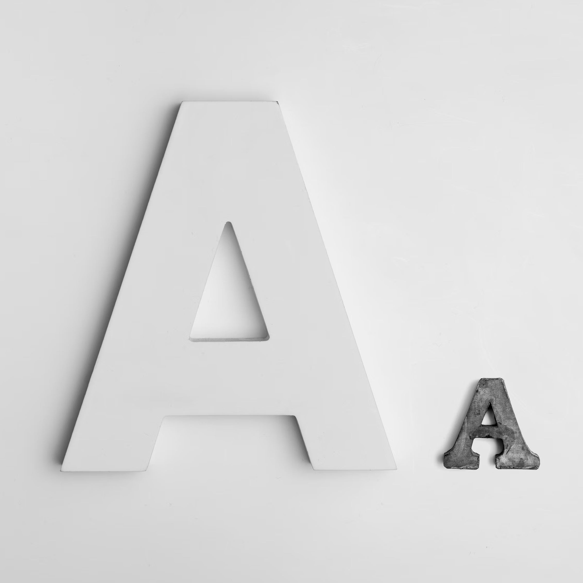
Typeface vs. Font: Understanding the Distinction
A Brief History
Typography, the art and technique of arranging type, has evolved significantly over centuries. Originating from the movable type invented by Johannes Gutenberg in the 15th century, typography has undergone various transformations. During the early days of printing, the term "typeface" referred to a particular design of type, while "font" denoted a specific size, weight, and style of that typeface. However, in the digital age, these terms have often been used interchangeably, leading to some confusion.
Typeface: The Design
A typeface is essentially the artistic design of letters and characters. It encompasses all the individual fonts that share a common design. For example, Arial is a typeface, and it includes variations such as Arial Bold, Arial Italic, and Arial Regular. Think of a typeface as a family of fonts that share the same visual characteristics. Typefaces are created with specific aesthetic and functional purposes, designed to convey a particular tone or style.
Examples of Popular Typefaces
1. Helvetica: Known for its clean, modern look, Helvetica is widely used in various design contexts, from corporate branding to signage.
2. Times New Roman: A classic serif typeface, often used in academic and professional documents.
3. Comic Sans: A casual, playful typeface, frequently used in informal contexts.
Font: The Specific Style
A font is a specific member of a typeface family. It refers to the combination of typeface, weight, size, and style. For example, within the Arial typeface family, Arial Bold at 12 points is a different font than Arial Italic at 10 points. In the metal type era, fonts were the actual physical pieces of metal or wood that were used to print letters on paper. Today, in the digital realm, fonts are files that store the design information.
Examples of Fonts
1. Arial Bold 12pt: A bold version of Arial, used for emphasizing text.
2. Times New Roman Italic 10pt: An italic version of Times New Roman, often used for citations or emphasis in text.
3. Helvetica Light 14pt: A lighter, larger version of Helvetica, used for a subtle and elegant appearance.
Why the Confusion?
The confusion between typeface and font largely stems from the digital revolution. In the era of desktop publishing, software began referring to typefaces as "fonts," leading to the interchangeable use of the terms. This shift was partly due to the convenience of referring to all digital type elements under one umbrella term. However, for typographers and designers, the distinction remains significant.
Understanding the difference between typeface and font can enhance your typographic choices and communication with other designers. Here’s a quick guide on when to use each term:
- Typeface: Use this term when referring to the overall design of a set of characters. For example, when discussing design options or branding choices, you might say, "We should use the Helvetica typeface for its modern look."
- Font: Use this term when specifying a particular style, weight, and size. For instance, in a design brief, you might specify, "Use Arial Bold 14pt for the headlines.

Conclusion
While the terms typeface and font are often used interchangeably, understanding their differences can greatly enhance your design vocabulary and precision. A typeface is the overall design, while a font is a specific instance of that design. By using these terms correctly, you can communicate more effectively with fellow designers and typographers, ensuring your design projects are executed with clarity and precision.In summary, the distinction between typeface and font, rooted in the history of typography, remains relevant today. Recognizing and applying these terms correctly can significantly impact your design choices and professional communication.

